When the slide gets in your way
Text-heavy slides, cluttered bullet lists and tables stuffed with data — they're not just ugly. They get in your way as a presenter. In practice the audience can't read and listen at the same time — and if forced to choose, they almost always choose to read. You have two options: stay quiet until they've finished reading, or improve your slides. If you stay quiet you run into a new problem — you have no idea how long each person needs before they're done. And staying quiet for that long feels unbearable for most presenters.
Count the dots
Before we get into walls of text and tables — a quick demonstration of why having lots of objects on a slide is a bad idea.
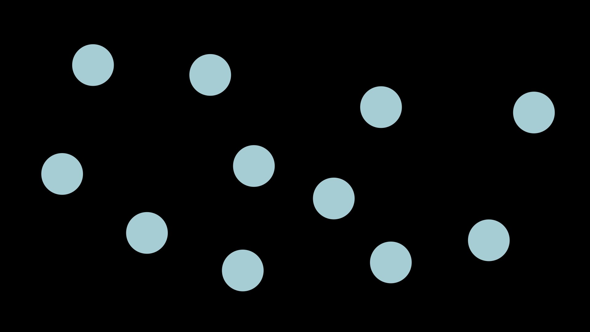
How long did it take you to arrive at the answer? Almost everyone has to count the dots, which takes time. If there are fewer than six dots in the image you see it without counting — instantaneously. If the people listening to your presentation are busy counting objects or working out what your image shows, they can't take in what you're saying at the same time. There's a rule of thumb: a maximum of six objects per slide. There's a reason for that rule. Use it.
Wall of text
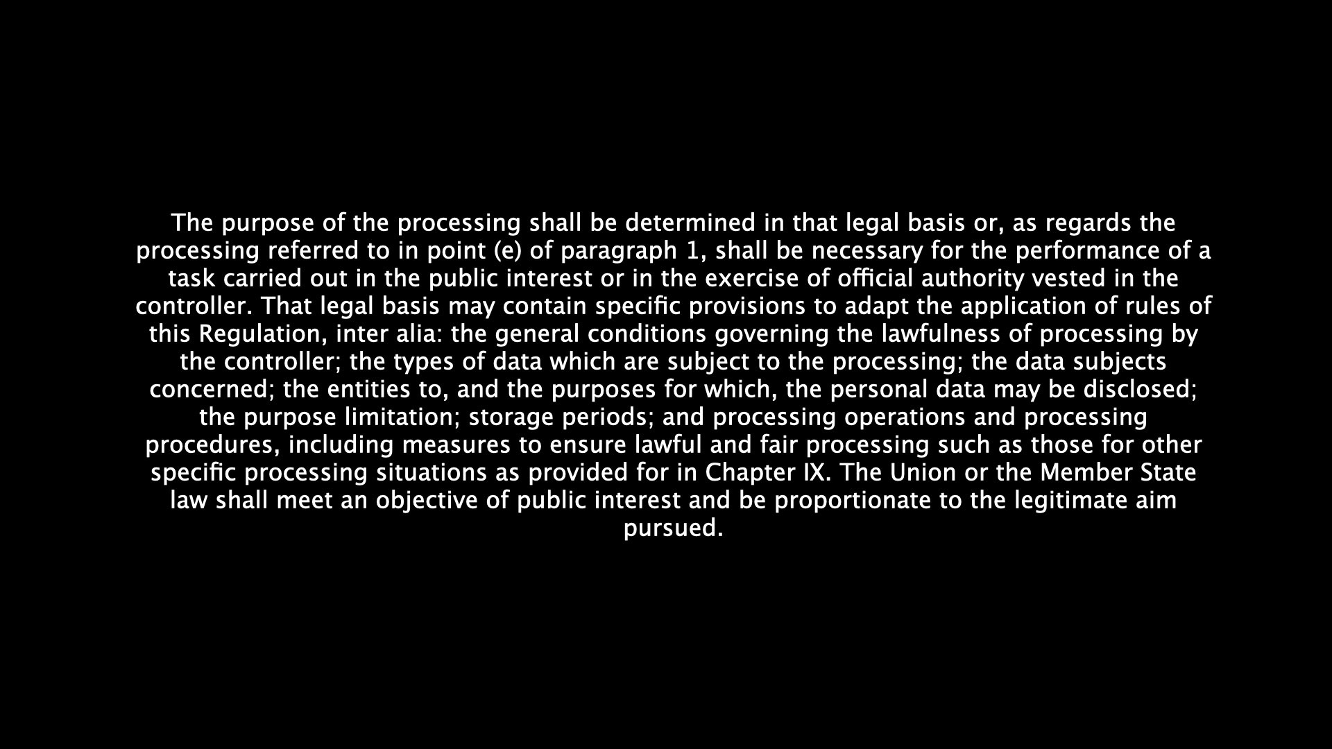
When all the text on a slide has to fit, your slide becomes a wall of text. The audience starts reading — and stops listening. You become redundant.
This is an example from the Swedish national curriculum about equal education. The text matters. But this is the wrong place for it. When you put a whole paragraph of statutory text on a slide, you're effectively saying: read this instead of listening to me. That's not what you want to say.
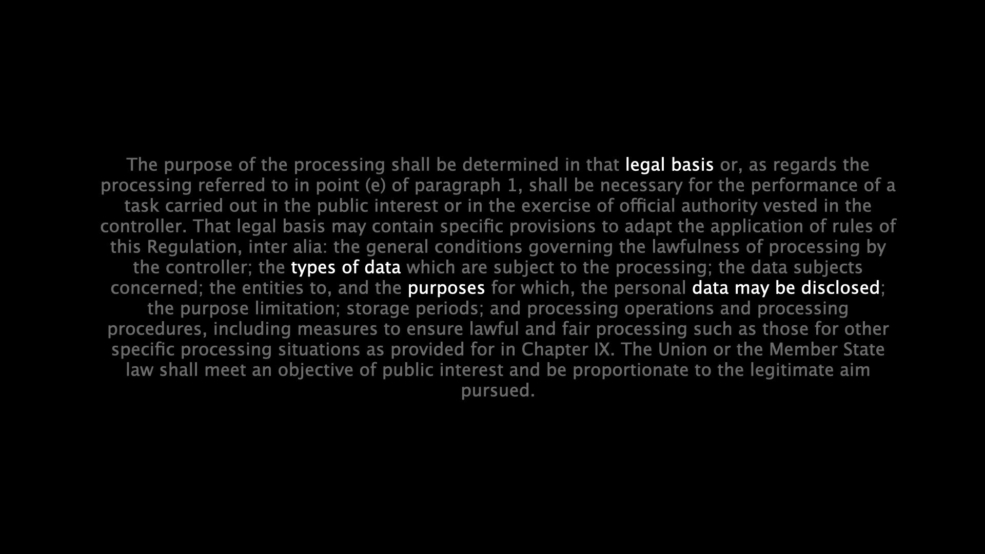
The best solution is not to have the text on the slide at all — quote the key sentence, cite the source, and talk about what it means. But if you must show the entire paragraph, there's a middle path: highlight what matters right now and dim the rest. Then the text works as a reference, and your voice gets to lead the reading.
The bullet list dilemma
Bullet lists feel safe. They look structured. But they often communicate nothing at all — only that the presenter has made a list. How many bullet lists in your life do you actually remember? Probably none.
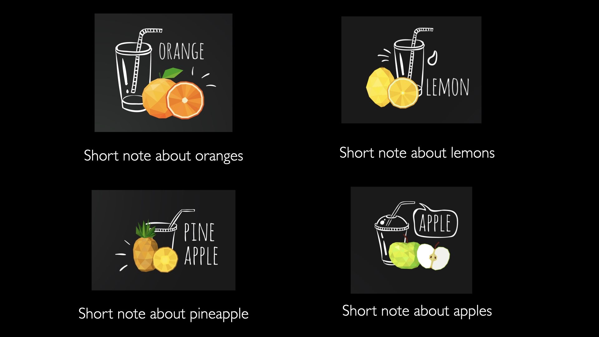
Either every word matters — in which case it belongs in a document. Or only the keyword matters — in which case it's enough to say it. The space in between is the worst. And usually there's a third path: replace the list with images that have short labels. Each point becomes something to look at, not something to read.
Tables — good and bad
A table is a powerful tool when you have data that needs to be compared. On a slide it usually becomes a problem. The audience can't read, compare and listen to you all at once.
If you have to show data on a slide: highlight the one thing that matters. Dim the rest. Show the whole table as background reference, but let one column or one row carry the point — that's the part that gets full contrast. Everything else is muted into supporting information.
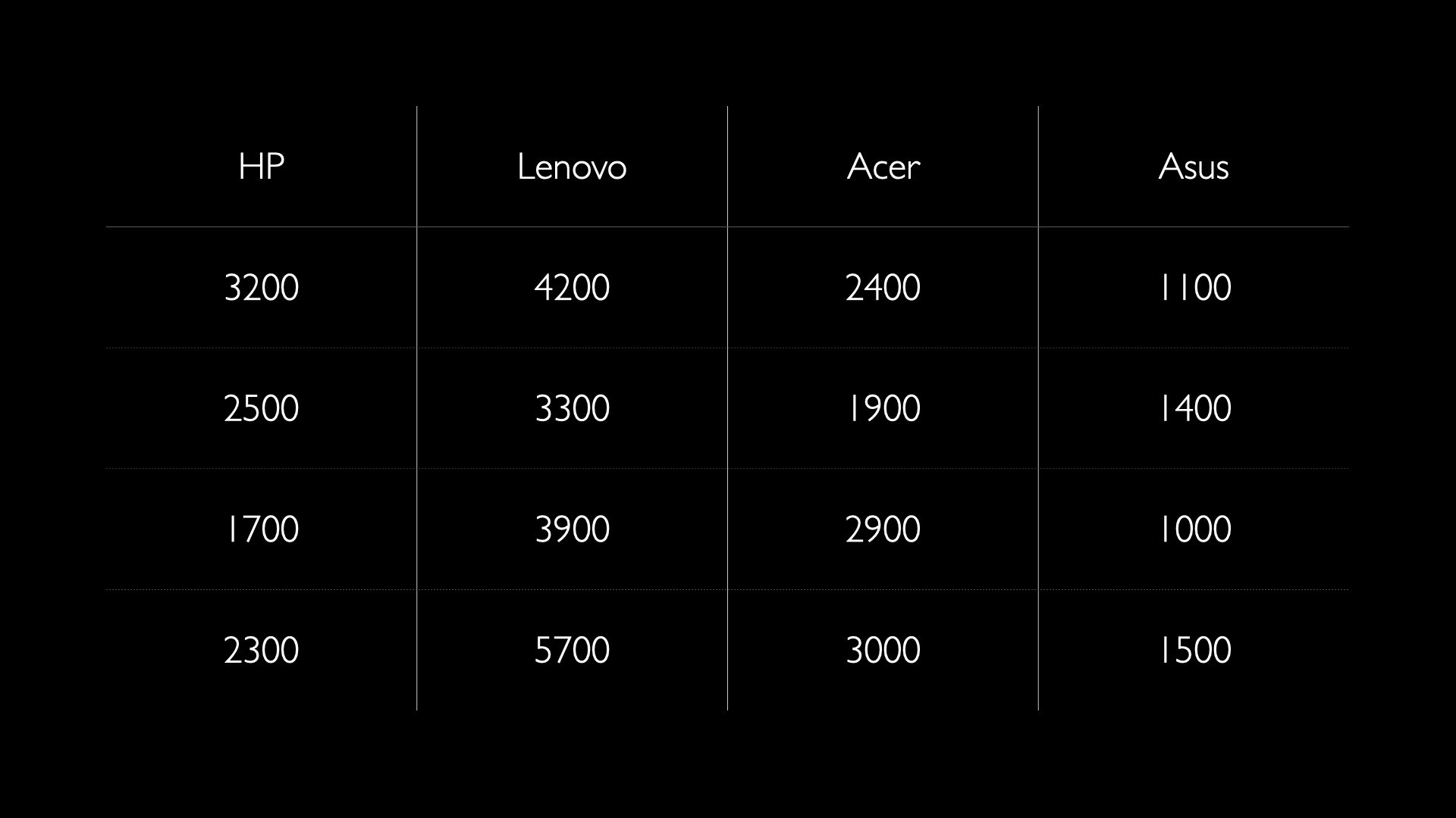
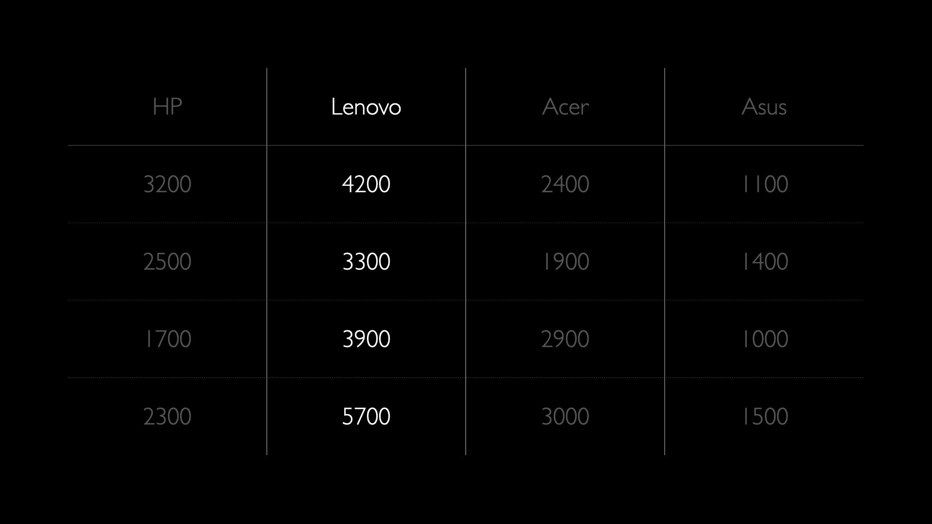
The technique works just as well on rows as on columns — and combined with what you say it becomes very clear where the audience should look at any given moment. You guide the reading instead of leaving it open.
Templates, animations and the two-slide principle
The built-in templates in Keynote and PowerPoint are usually not designed for you. They're designed to scale — to work "well enough" for millions of users. In practice that means they're never specifically right for what you're going to say. Skip them.
The more you try to cram onto a slide, the more likely it is to get worse. Background images, logos, icons in the corners, animations, decorative boxes — every element competes with what you actually want to say. This is an extreme case, but the principle is the same in milder doses:
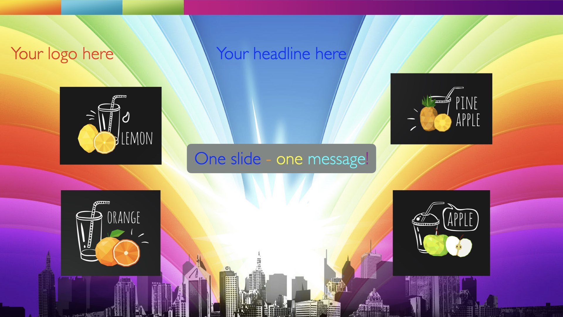
Animations are a similar problem. Text flying in from six directions, spinning logos, "fade with bounce" — they pull attention away from the content and onto the tool. A simple cross-fade or a blank black slide as a pause is usually better. Animation should serve a function, not be an effect.
The two-slide principle is useful when you're tempted to stuff more information onto an already full slide: build two slides instead. One you show; it doesn't contain all the information. The other you don't show. It's intended as reading material afterwards for those who want to go deeper.
Image quality
A blurry image on a slide says something about you as a presenter before you've said a word. It says you didn't take the time to find a good image. Or that you don't care — and that signal is even worse. If you don't care, why should your audience?
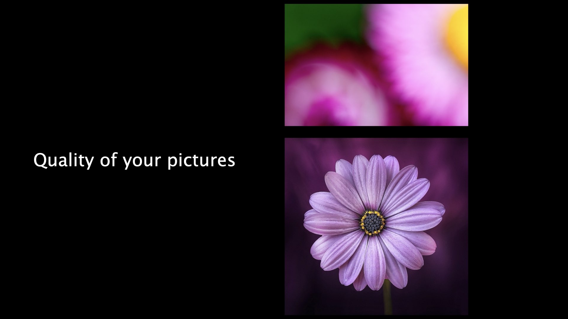
Use high-resolution images, but make sure they connect to your message — otherwise they don't belong there. If you don't have a good version: switch images, or skip it entirely. A slide without an image is always better than a slide with an image that looks amateur.
Exercise: your own wall of text
Think about a presentation you gave recently. Which slide was the most text-heavy — and what did you actually want to convey with it?
What you write here is raw material for a makeover. In the deep dive below we walk through twelve recurring principles — many of them will fit what you just described.
Deep dive: twelve principles for better slides
Twelve recurring problems and what to do instead — from template chrome to animations to headings that say nothing. ~10 min read.